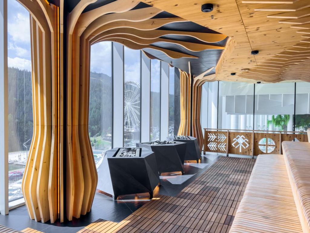
Finding Harmony: How to Balance Warm and Cool Tones

Chosen theme: How to Balance Warm and Cool Tones. Explore practical, inspiring ways to blend cozy warmth with refreshing coolness across interiors, style, and visuals. Share your palette experiments in the comments and subscribe for weekly color wisdom and creative prompts.

Color Temperature 101: The Science Behind Harmony

Psychology of Warm and Cool

Warm tones like amber, coral, and terracotta suggest comfort, sociability, and appetite, while cool tones such as slate, teal, and sky blue signal calm, clarity, and focus. Blend both intentionally to avoid rooms that feel either restless or icy, and tell us which mood you seek.

Undertones and Neutrals

Neutrals secretly lean warm or cool. Greige can carry beige warmth, while many grays hide blue or green undertones. Test swatches beside a true white paper and under different lights. Subtle undertones decide whether your space feels cohesive or strangely off.

The 60–30–10 Rule, Temperature Edition

Use sixty percent neutral anchor, thirty percent opposite temperature, and ten percent unifying accents. Imagine a cool gray base, generous walnut wood for warmth, and small brass moments that sparkle. This structure keeps energy and calm in dialogue. Subscribe for printable balancing checklists.

Room-by-Room Balance Strategies

Start with a cool gray sofa, then add rust velvet pillows, a walnut coffee table, and an icy blue throw. Ground everything with a black metal floor lamp and a soft, warm rug. This rhythm guides the eye. Share your palette mockups for feedback.

Room-by-Room Balance Strategies

For rest, lead with cool blues or soft sage, then wrap warmth through timber side tables and dimmable 2700K lamps. Linen bedding bridges both temperatures beautifully. Keep patterns quiet and tactile. What combination helps you unwind most after long days and late nights?

Materials and Textures That Bridge Temperatures

Warm brass sings when paired with brushed nickel or chrome, but anchor one as dominant to prevent visual noise. Repeat a finish three times for cohesion. Matte or satin surfaces soften contrast. Tell us which metal combo you are brave enough to try first.

Materials and Textures That Bridge Temperatures

Walnut reads warm and cozy, while ash and oak can lean cooler depending on stain. Marble veining may carry blue or taupe, steering temperature in subtle ways. Build sample boards under natural light before committing. A tiny shift in undertone transforms everything quietly.

Lighting: Your Invisible Color Thermostat

Bulb temperature matters. Try 2700K for cozy warmth, 3000K for balanced living, and 4000K for crisp tasks. Seek high color rendering index ratings so hues appear accurate. Dimmers let evening scenes glow without muddying undertones. What Kelvin range do you prefer at night?

Lighting: Your Invisible Color Thermostat

Morning north light skews cool, afternoon sun warms everything. Sample paints on multiple walls and observe for a full day. Cooler rooms benefit from warm accents, while sunlit spaces can welcome cooler relief. Document the changes with photos and share your observations for others.

Personal Style: Balancing Warm and Cool in Fashion

Check wrist veins and jewelry preference to guess undertones. Cooler complexions love silver, warmer ones glow in gold. But mixed palettes can flatter everyone. Test with a simple white tee under daylight, then with cream. Tell us which shade makes your face light up naturally.

Personal Style: Balancing Warm and Cool in Fashion

Combine cool denim and crisp white with a camel coat for warmth, then tie it together with a burgundy scarf. Sneakers in bright white keep the look fresh. One warm piece, one cool piece, one connector accessory. Share your go-to trio for busy mornings.

Photography and Editing: Temperature in Visual Storytelling

Nail the White Balance

Shoot RAW, use a gray card, and set Kelvin manually when possible. Correct white balance keeps skin believable while preserving ambiance. Overcooling looks sterile; overwarming looks muddy. Share before and after frames that show how tiny adjustments transform storytelling and viewer feeling.

Split-Toning for Subtle Harmony

Warm highlights and cool shadows create cinematic depth, or reverse for moonlit drama. Keep saturation gentle to avoid cartoonish results. Match grading to narrative intent. Try a five minute edit challenge today and post your settings so readers can learn from your approach.

Calibrate and View Consistently

Use a monitor calibrator and consistent profiles so colors translate. Bright phones can trick you into underexposing, while uncalibrated screens skew temperature wildly. I once printed a teal couch that looked green at home. Calibrate, proof, and subscribe for our monthly color correction checklist.

A Small-Space Makeover: One Weekend, Two Temperatures

A friend’s studio felt cold with blue-gray walls and chrome everywhere. We introduced clay pots, a walnut ledge, and a warm jute rug, then kept cool sky curtains for freshness. The space finally hugged and breathed at once. Tell us your first impression reactions.

A Small-Space Makeover: One Weekend, Two Temperatures

Our initial beige looked pink at night, fighting the gray. Under warm lamps, its undertone misbehaved. We sampled again, switching to a truer greige and adjusting bulb temperature. Lesson learned: always test with lighting you actually use. Share your near misses for community wisdom.
Evolutiondetailings
Privacy Overview

This website uses cookies so that we can provide you with the best user experience possible. Cookie information is stored in your browser and performs functions such as recognising you when you return to our website and helping our team to understand which sections of the website you find most interesting and useful.